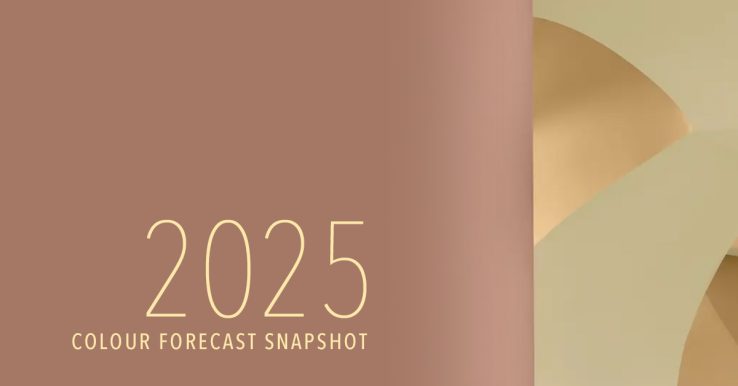
Optimism and Tranquility Abound in 2025 Colour Palettes
Colour Inspiration for 2025
As a child of the 1970s, browns and earth tones coloured my world. According to tastemakers, it looks like the year ahead will be a throwback to those hues.
I recall those colours being comforting and calming. Which may partly be why we are revisiting them now. It doesn’t bear explaining why most of us could do with an optimistic and tranquil palette in 2025.
Pantone Colour of the Year
This year, color trends are set to embrace both warmth and vibrancy. Pantone has chosen ‘Mocha Mousse’ as its Color of the Year, a rich brown hue inspired by chocolate and coffee. This selection reflects a desire for comfort and harmony.
Dulux Colour of the Year
Similarly, Dulux has named True Joy™ as its Color of the Year, an uplifting yellow that brings optimism and energy to spaces. These choices highlight a blend of earthy tones and bright accents, offering designers a versatile palette for creative expression.
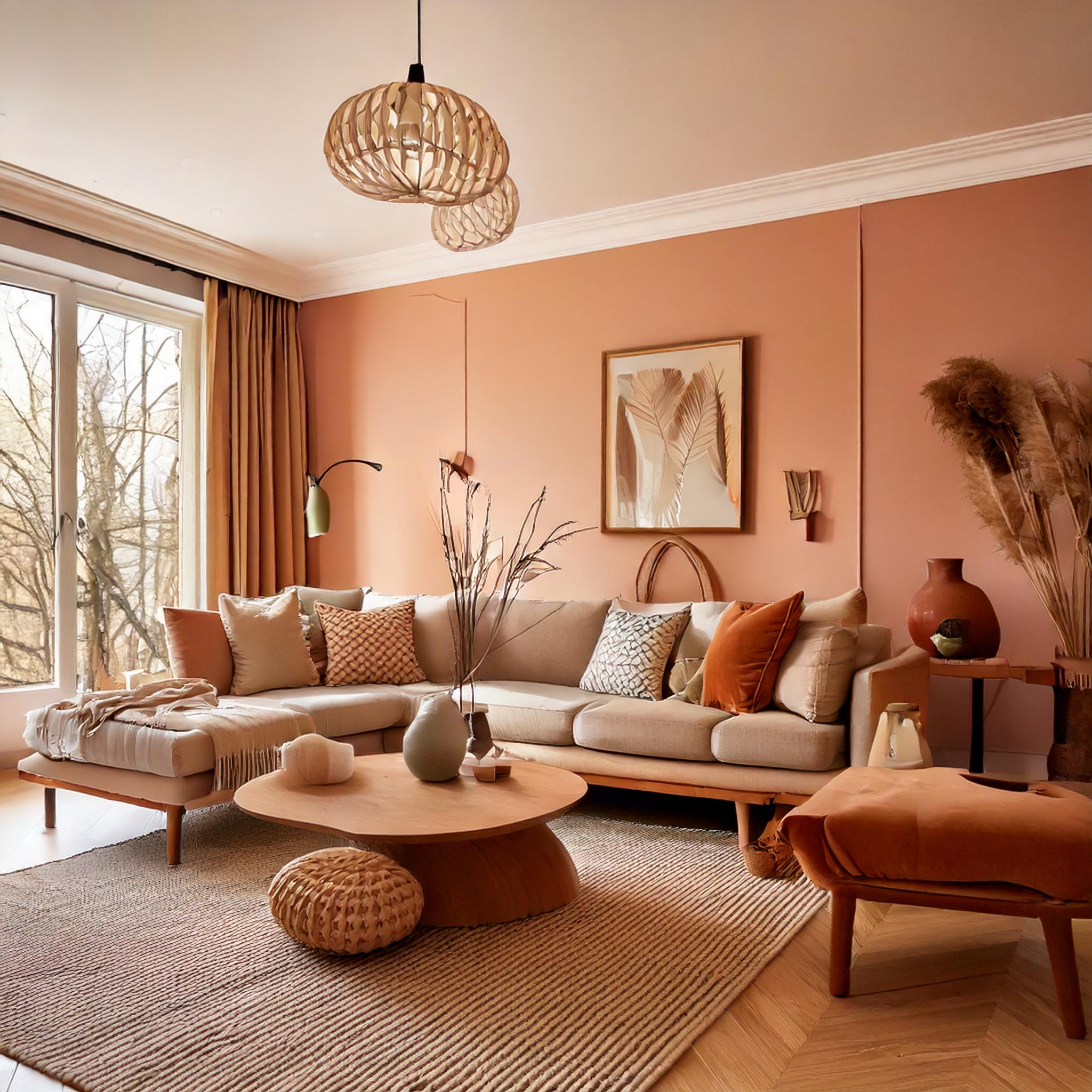
These warm hues work well when offset with their cooler complementary colours. They also harmonize well with beiges and pastels – which have already been making their way into our lives.
These colours have been trending on Adobe’s colour website. You can reserach and download directly from this Adobe site. It’s a great way to import colour palettes into your Adobe Creative Cloud apps.
So here’s to an optimistic and tranquil 2025!


