Top Five Font Trends
Searching for a new font for an upcoming project?
My clients often ask me what new fonts I would recommend. In all honesty I’m a stickler for the classics. I have a few classics that I always come back to and am often surprised at the new ways I can find to use them.
That said, throwing a new ingredient into the mix can be a great way to find inspiration. Over the past few years there have been some very interesting developments in font trends. I’ve decided to compile some of the directions that have caught my attention.
1. Slab Serifs
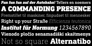
These timeless classics were originally used for street advertising in the early 1800’s. However in recent years there has been a renaissance of Slab Serifs. These fonts can evoke a multitude of feelings. Sometimes formal and technical such as Din Next Slab and other times warm yet strong such as Bree Serif.
When and how should you use?
These fonts are best employed for display text rather than body copy. Perfect for headlines in reports or press advertisements.
Our Top Picks
http://www.fontsquirrel.com/fonts/bree-serif
http://www.myfonts.com/fonts/linotype/din-next-slab/
2. Scripts
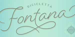
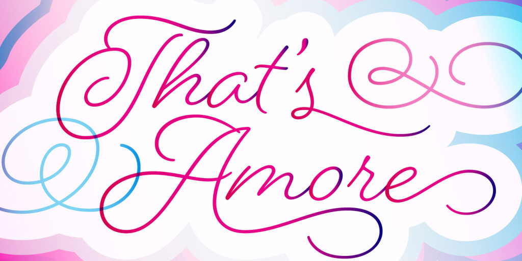
These fonts still continue to dominate in 2015. However recently we have seen a number of more refined scripts emerge. These newer scripts have a monoline stroke and are reminiscent of 20th century penmanship.
When and how should you use?
Use sparingly and never in CAPS. Appropriate for both formal and casual application. Great for events, hospitality and when you are looking for strong personality.
Our Top Picks
http://www.myfonts.com/fonts/positype/flirt-script/
https://www.myfonts.com/fonts/laura-worthington/beloved/
3. San Serif
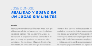
San-serifs are employed for their no-nonsense , clean and contemporary feel. There are so many great classics as well as reinvented ones. Many new san-serifs have a softness and warmth to them. Look for a san-serif available in a large range of characters (glyphs) and weights. They really are a versatile bunch.
When and how should you use?
These fonts are great for both display and body copy. Perfect for reports, journals, sales material and advertising. Team them with a script or slab serif for extra personality.
Our Top Picks
http://www.myfonts.com/fonts/tipotype/marine/
https://www.myfonts.com/fonts/latinotype/corporative-sans/
4. Vintage and hand written
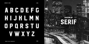
Unless you have been living under a rock for the last few years you will be familiar with these fonts. This category is pretty broad and can incorporate scripts and san-serifs. Obviously only used for display.
When and how should you use?
Use for personality. Many offer a warm, handmade artisan feel. Logos, signage, menus.
Our Top Picks
https://www.myfonts.com/fonts/virtuecreative/hudson-ny/
http://www.myfonts.com/fonts/sudtipos/hipster-script-pro/
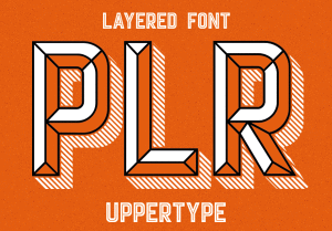
5. Multilayered Stackable Fonts
This trend is part of the retro trends we have seen of late. These fonts tend to be friendly and fun. Often provide amazingly 3-dimensional effects.
When and how should you use?
Should only be used for display. Great for retail and hospitality. Old hand-drawn look works well for signage.
Our Top Picks
http://uppertype.net/fonts/player.htm
http://www.hipopotamstudio.pl/#/en/portfolio/typefaces/mrs_onion/
Handle with Care
Keep in mind that trends will come and go. Choose your typefaces carefully and ensure they are appropriate for your job and the audience you are trying to reach. Before beginning the search for a new typeface why not try revisiting some of the old classics, you may be pleasantly surprised.


